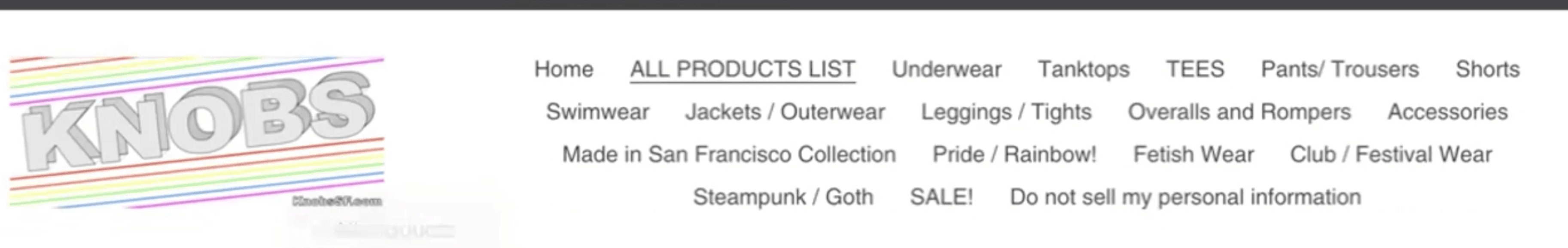
E-commerce Website Redesign

Website Redesign

Knobs

Knobs SF is a San Francisco-based retailer specializing in men's fashion, particularly catering to the LGBTQ+ community.

Knobs SF is a San Francisco-based retailer specializing in men's fashion, particularly catering to the LGBTQ+ community.

UX Designer • UI Designer • Researcher

UX Designer • UI Designer • Researcher

3 weeks

3 weeks

Solo Project

Solo Project

Visit Project

Visit Project

Overview

Overview

Knobs SF is a bold, queer-owned clothing store based in San Francisco, specializing in men’s fashion for the LGBTQ+ community. Located in the heart of the Castro, Knobs is known for its vibrant in-store experience with eye-catching displays, welcoming energy, and a wide selection of clothing for clubs, festivals, and fetish events. As a current customer, I’ve experienced firsthand how easy and fun it is to shop in person. 

Knobs SF is a bold, queer-owned clothing store based in San Francisco, specializing in men’s fashion for the LGBTQ+ community. Located in the heart of the Castro, Knobs is known for its vibrant in-store experience with eye-catching displays, welcoming energy, and a wide selection of clothing for clubs, festivals, and fetish events. As a current customer, I’ve experienced firsthand how easy and fun it is to shop in person. 

However, the online store didn’t reflect that same energy. The website felt disconnected, outdated, and difficult to navigate, making it hard for users to find what they were looking for. This case study explores how I redesigned Knobs’ e-commerce experience to better reflect its identity so that it’s just as functional, intuitive, and fun as the brick-and-mortar store.

However, the online store didn’t reflect that same energy. The website felt disconnected, outdated, and difficult to navigate, making it hard for users to find what they were looking for. This case study explores how I redesigned Knobs’ e-commerce experience to better reflect its identity so that it’s just as functional, intuitive, and fun as the brick-and-mortar store.

Problem

Problem

Knobs' existing website felt visually outdated and confusing to navigate, with cluttered categories, unclear product flows, and a lack of filtering or guidance. Customers often felt overwhelmed by the overlapping product categories and inconsistent content, making it difficult to find and purchase items. On top of that, the visual design failed to capture the vibrant in-store energy that makes Knobs unique.

Knobs' existing website felt visually outdated and confusing to navigate, with cluttered categories, unclear product flows, and a lack of filtering or guidance. Customers often felt overwhelmed by the overlapping product categories and inconsistent content, making it difficult to find and purchase items. On top of that, the visual design failed to capture the vibrant in-store energy that makes Knobs unique.

Solution

Solution

I redesigned the Knobs online store with a focus on clarity, identity, and flow. By conducting user interviews, a card sorting exercise, and building out a full task flow around a real user persona, I restructured the site’s information architecture, introduced a new visual identity, and built a high-fidelity prototype. The result is a shopping experience that’s bold yet intuitive, empowering users to explore, filter, and shop confidently—just like they would in-store.

I redesigned the Knobs online store with a focus on clarity, identity, and flow. By conducting user interviews, a card sorting exercise, and building out a full task flow around a real user persona, I restructured the site’s information architecture, introduced a new visual identity, and built a high-fidelity prototype. The result is a shopping experience that’s bold yet intuitive, empowering users to explore, filter, and shop confidently—just like they would in-store.

The Design Journey

To redesign Knobs' digital experience with confidence and empathy, I followed a design process grounded in behavioral insight, UX best practices, and user-centered thinking. Because the original website was functional but frustrating,
I focused on uncovering where and why users were getting stuck.

To redesign Knobs' digital experience with confidence and empathy, I followed a design process grounded in behavioral insight, UX best practices, and user-centered thinking. Because the original website was functional but frustrating,
I focused on uncovering where and why users were getting stuck.

My Research Process included:

My Research Process included:

Heuristic Evaluation

Identified usability issues and interface inconsistencies

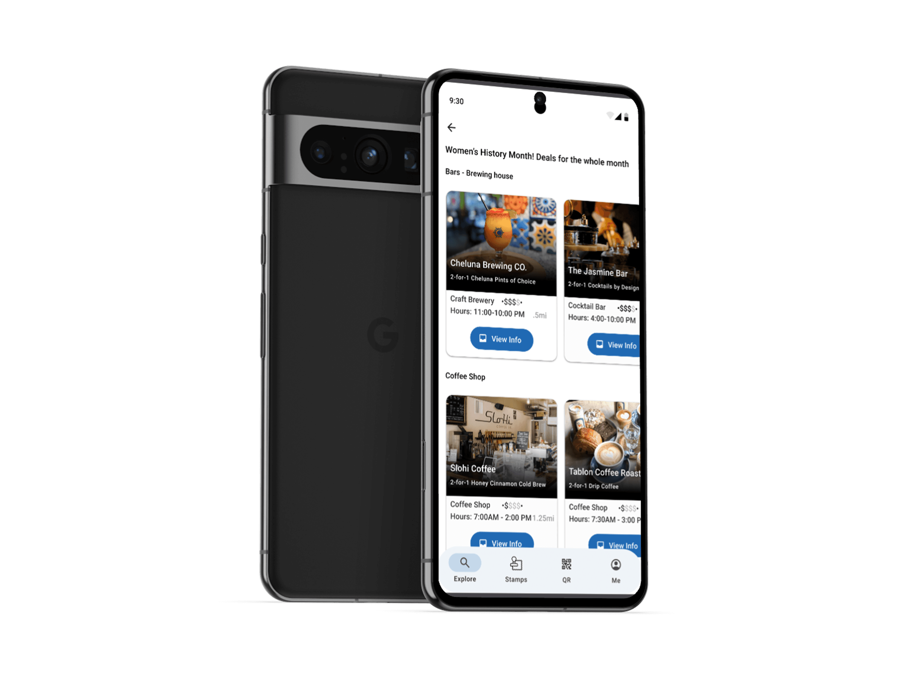
Competitive Analysis

Evaluated Knobs against local stores in the area.

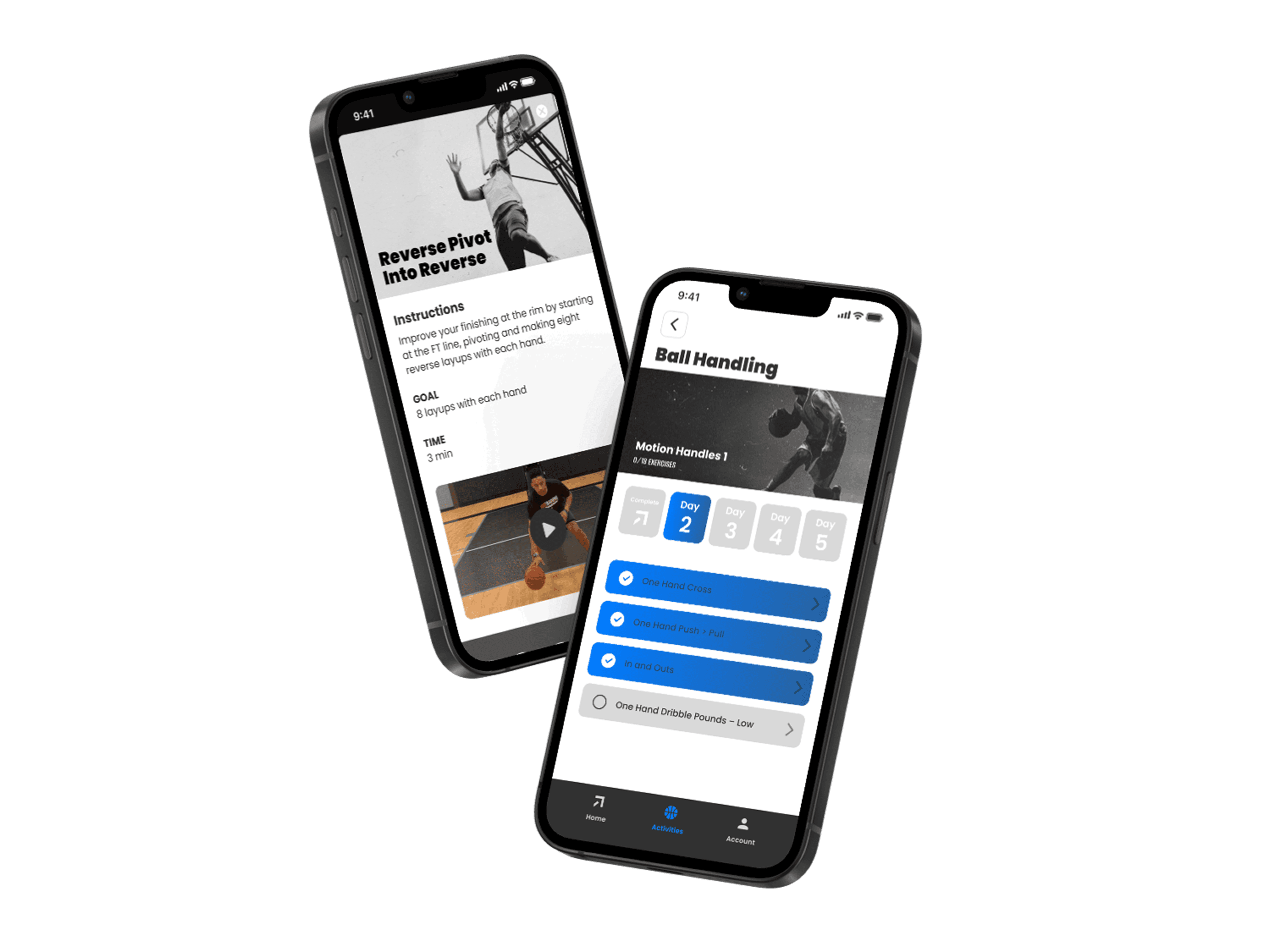
Usability Test (4 users)

Observed real users completing key tasks, noting friction points and behaviors.

User Interview (4 users)

Explored motivations, frustrations, and goals while shopping for menswear online.

User Persona

Synthesized findings into a user persona that reflected shared needs and habits.

Card Sorting

Restructured product categories based on how users naturally group and label items.

This combination of approaches and user feedback allowed me to build a redesign strategy rooted in both usability and emotional connection.

This combination of approaches and user feedback allowed me to build a redesign strategy rooted in both usability and emotional connection.

Are similar stores doing this better?

As a current client of Knobs and a frequent shopper of other boutique menswear brands, I decided to display where the competitors are located in San Francisco, and surprisingly, all of them are in the same neighborhood, which makes a solid competitive environment.

As a current client of Knobs and a frequent shopper of other boutique menswear brands, I decided to display where the competitors are located in San Francisco, and surprisingly, all of them are in the same neighborhood, which makes a solid competitive environment.

However, I wanted to know if similar brands are doing this better. To find out, I started with competitive analysis to assess the strengths and weaknesses of Knobs's Market in comparison to direct and aspirational competitors.

Entour, Blade and Blue, Rolo, and Freeborn. These brands were selected because they target a similar audience with curated menswear collections and store-style offerings. 

This analysis showed that Knobs was falling behind in both usability and branding cohesion. Because competitors like Freeborn and Blade +  Blue successfully balanced clean design with brand storytelling. 

I decided to use Blade + Blue as a key comparator for the redesign, drawing inspiration from their navigation structures, homepage hierarchy, and product page layouts. But, I also recognized the need to differentiate Knobs through its unique in-store character and curated inventory. Therefore, I aimed to enhance usability while preserving its boutique charm and voice, bridging the digital gap that kept it from competing effectively online.

Understanding the boutique: The Original Website

I began with a heuristic evaluation to identify immediate usability issues across the site. This provided a foundational lens for what was blocking users from efficiently completing tasks or enjoying their shopping experience.

I began with a heuristic evaluation to identify immediate usability issues across the site. This provided a foundational lens for what was blocking users from efficiently completing tasks or enjoying their shopping experience.

These early insights pointed to critical gaps in navigation, visual hierarchy, and user control.
But identifying these issues from my perspective was just the start. Therefore, I needed to validate or challenge these findings by observing real users interact with the site directly.

These early insights pointed to critical gaps in navigation, visual hierarchy, and user control.
But identifying these issues from my perspective was just the start. Therefore, I needed to validate or challenge these findings by observing real users interact with the site directly.

Taking a Behavioral Approach

To better understand how real users interact with the current Knobs website, I adopted a behavioral approach by conducting moderated usability tests with 4 participants.
Because heuristic evaluation alone couldn't fully capture user frustration, I wanted to observe actual user behavior in real-time, focusing on their thought process, navigation patterns, and pain points.

The usability test was designed to:

  • Evaluate the ease of navigation across key tasks

  • Identify usability issues that cause friction

  • Gather direct feedback on layout, visual design, and functionality

  • Benchmark interaction using time on task and number of clicks

The usability test was designed to:

  • Evaluate the ease of navigation across key tasks

  • Identify usability issues that cause friction

  • Gather direct feedback on layout, visual design, and functionality

  • Benchmark interaction using time on task and number of clicks

Users were asked to complete 4 core tasks that simulate typical shopping behaviors. Each task was timed and counted by the number of clicks.

Users were asked to complete 4 core tasks that simulate typical shopping behaviors. Each task was timed and counted by the number of clicks.

Task 1

Task 1

Find a black long-sleeve shirt under $50 and add it to the cart

Task 3

Task 3

Proceed to checkout (stop before payment)

Task 2

Task 2

Locate return & exchange

Task 4

Task 4

Explore the "Made in San Francisco" Collection

From this test, several insights became clear:

From this test, several insights became clear:

Navigation is a primary point of friction.
Poorly labeled categories and the absence of filtering slowed task completion.

Navigation is a primary point of friction.
Poorly labeled categories and the absence of filtering slowed task completion.

Product visibility needs work.
There was no indication for sold-out items, which confused users.

Product visibility needs work.
There was no indication for sold-out items, which confused users.

The interface lacks recovery options.
Users noted the absence of a “back” button, which made error correction difficult.

The interface lacks recovery options.
Users noted the absence of a “back” button, which made error correction difficult.

Aesthetics and branding are appreciated, but inconsistent. Requested larger fonts, stronger contrast and "About Us" Section.

Aesthetics and branding are appreciated, but inconsistent. Requested larger fonts, stronger contrast and "About Us" Section.

By observing actual user interactions, I uncovered critical points where users hesitated or got lost. Therefore, my redesign focused on:

By observing actual user interactions, I uncovered critical points where users hesitated or got lost. Therefore, my redesign focused on:

Simplifying Navigation

Simplifying Navigation

Improving information architecture

Improving information architecture

Cohesive visuals

Cohesive visuals

Intuitive shopping flow

Intuitive shopping flow

Getting into the shoppers mindset

To gain deeper insights into user behaviors and expectations, I conducted four in-depth interviews with individuals who frequently shop for men’s fashion online. My goal was to explore their shopping journey, from browsing to checkout, and uncover pain points, goals, and needs that could inform design decisions.

To gain deeper insights into user behaviors and expectations, I conducted four in-depth interviews with individuals who frequently shop for men’s fashion online. My goal was to explore their shopping journey, from browsing to checkout, and uncover pain points, goals, and needs that could inform design decisions.

I synthesized insights using an Affinity Map, clustering answers into recurring patterns. This helped me uncover trends across users and identify actionable “I statements” to guide design direction.

I synthesized insights using an Affinity Map, clustering answers into recurring patterns. This helped me uncover trends across users and identify actionable “I statements” to guide design direction.

Here are the insights from the affinity map:

Shopping promotions: I'm more likely to buy when I see sales upfront, and recommendations.

Shopping promotions: I'm more likely to buy when I see sales upfront, and recommendations.

"Recs for complementing items/accessories"

"Seeing sales items upfront definitely makes it easier to make decisions"

"If there is a sale then I am more likely to purchase."

Checkout Experience: I want simple, fast checkout with Apple Pay or guest options.

Checkout Experience: I want simple, fast checkout with Apple Pay or guest options.

“I want Apple Pay or guest checkout so I don’t have to enter all my info.”

"I definitely want a guest checkout option."

"I feel safer when sites don’t store my information."

"I traditionally don’t give sites my email address because I hate spam."

Navigation Frustrations: I find too many similar products, confusing categories, and excessive ads frustrating when shopping online

Navigation Frustrations: I find too many similar products, confusing categories, and excessive ads frustrating when shopping online

“Too many overlapping categories make it hard to know where to click.”

"It is difficult when there is an overwhelming amount of the same product. "

"I don’t like too many descriptions or overcomplicating it."

"there are too many categories and they overlap, e.g. outdoor that also has jeans and shorts"

Shopping preferences: I value curated options based on my style and purchase history

Shopping preferences: I value curated options based on my style and purchase history

“High-quality images and clear sizing guides are a must.”

“I want to see how clothes fit on different body types.”

“I need reviews and real-user photos to feel confident about sizing.”

"I just like pictures and reviews are helpful for sizing and fit."

These qualitative insights helped bridge the gap between user expectations and business goals, serving as a foundation for the persona and future design iterations.

These qualitative insights helped bridge the gap between user expectations and business goals, serving as a foundation for the persona and future design iterations.

Bringing online shoppers to life

Bringing online shoppers to life

To bring the research insights to life, I created a persona that reflects the goals, frustrations, and behaviors of a typical user in the men's fashion shopping space. This persona helped me empathize with users and shape design solutions that address their real-world challenges.

To bring the research insights to life, I created a persona that reflects the goals, frustrations, and behaviors of a typical user in the men's fashion shopping space. This persona helped me empathize with users and shape design solutions that address their real-world challenges.

To bring the research insights to life, I created a persona that reflects the goals, frustrations, and behaviors of a typical user in the men's fashion shopping space. This persona helped me empathize with users and shape design solutions that address their real-world challenges.

Michael West

35 years old • San Francisco, CA | Graphic Designer • Online Shopping Customer

Bio:

Michael West is a 35-year-old designer based in San Francisco, California. He enjoys attending music festivals and participating in social events. He spends time exploring websites with easy navigation and well-designed layouts.

Scenario:

He doesn’t buy when there is an overwhelming amount of the same product or too many overlapping categories. He purchases when there are new products but sold out immediately.

Pain Points:

He's frustrated by limited product variety, intrusive ads, cluttered categories, and missing order confirmation emails.

Needs:

Michael wants curated, trendy options with clear descriptions, high-res visuals on real bodies, easy navigation, and a save-for-later feature.

Goals:

He prefers Apple Pay for speed and privacy, guest checkout for convenience, and upfront access to sale items to simplify decisions.


He prefers Apple Pay for speed and privacy, guest checkout for convenience, and upfront access to sale items to simplify decisions.

Pain Points:

He's frustrated by limited product variety, intrusive ads, cluttered categories, and missing order confirmation emails.

Needs:

Michael wants curated, trendy options with clear descriptions, high-res visuals on real bodies, easy navigation, and a save-for-later feature.

Goals:

He prefers Apple Pay for speed and privacy, guest checkout for convenience, and upfront access to sale items to simplify decisions.

Meet Michael West, a 35-year-old designer based in San Francisco, who enjoys shopping online for men's clothing. He values a fast and secure shopping experience when purchasing stylish outfits. However, the overwhelming number of ads and redundant product categories on current websites make it difficult for him to find what he’s looking for. He needs a better way to discover curated clothing options with detailed visuals to make informed purchasing decisions

Meet Michael West, a 35-year-old designer based in San Francisco, who enjoys shopping online for men's clothing. He values a fast and secure shopping experience when purchasing stylish outfits. However, the overwhelming number of ads and redundant product categories on current websites make it difficult for him to find what he’s looking for. He needs a better way to discover curated clothing options with detailed visuals to make informed purchasing decisions

Meet Michael West, a 35-year-old designer based in San Francisco, who enjoys shopping online for men's clothing. He values a fast and secure shopping experience when purchasing stylish outfits. However, the overwhelming number of ads and redundant product categories on current websites make it difficult for him to find what he’s looking for. He needs a better way to discover curated clothing options with detailed visuals to make informed purchasing decisions

Restructuring Walls for Knobs

When I began evaluating Knobs' website, I noticed the navigation menu felt more like a maze than a map. The existing information architecture was cluttered with overlapping categories, some even leading to empty pages. The sheer number of options created friction for users who simply wanted to browse or buy an item quickly.

When I began evaluating Knobs' website, I noticed the navigation menu felt more like a maze than a map. The existing information architecture was cluttered with overlapping categories, some even leading to empty pages. The sheer number of options created friction for users who simply wanted to browse or buy an item quickly.

Represented as a sitemap, this structure revealed an overwhelming sprawl of categories lacking hierarchy and purpose. Users were met with redundant paths, ambiguous labels, and dead-end links. This wasn’t just poor organization—it was a blocker to proceed to checkout.

Represented as a sitemap, this structure revealed an overwhelming sprawl of categories lacking hierarchy and purpose. Users were met with redundant paths, ambiguous labels, and dead-end links. This wasn’t just poor organization—it was a blocker to proceed to checkout.

I asked myself:
How should these categories be grouped? What should they be called? How do people naturally search for products, and how do they expect to move through the site?
These weren’t questions I could answer alone. I needed shoppers to help rebuild the walls.

I asked myself:
How should these categories be grouped? What should they be called? How do people naturally search for products, and how do they expect to move through the site?
These weren’t questions I could answer alone. I needed shoppers to help rebuild the walls.

Shoppers sort, I design

To reimagine Knobs’ navigation with users at the center, I conducted an open card sorting exercise with five participants. Each person was given product cards on Figjam, representing various items from the store and asked to group them into categories and label them in ways that made sense to them.

Their mental models revealed what the existing structure failed to deliver: clarity, simplicity, and relevance. Here's what they showed me:

Participant 1

  • Emphasized underwear as a stand-alone category

  • Used "fetish" as a tag rather than a primary category

Participant 2

  • Preferred searching by item type, not style or vibe

  • Highlighted bright, mesh, and festive tags for filtering rather than navigating.

Participant 3

  • Took a tag-heavy approach, based on visuals or styling themes

  • Proposed tags like bi-color, organic print, sporty and sex party.

Participant 4

  • Categorized by item type, keeping it clean and direct.

  • Reinforced the need for intuitive, recognizable labels

Participant 5

  • Took a unique, visual-first approach; color and style

  • Advocated for visual organization over rigid structures.

The insights from these exercises led me to reimagine the sitemap not as a list of products, but as a guided exploration, rooted in how users naturally think, browse, and shop.

Key Improvements:

The insights from these exercises led me to reimagine the sitemap not as a list of products, but as a guided exploration, rooted in how users naturally think, browse, and shop.

Key Improvements:

Clear, item-based top categories

Featured, Tops, Bottoms, Underwear and Accessories

Event or vibes-based filters

Festival, Night Out, Everyday, Mesh, Metallic, Bright

Remove empty or inactive pages

that frustrates users.

Featured approach to discovery

Let users explore by theme without being locked into a category path, e.g., Pride Collection

This new structure simplifies navigation while empowering shoppers to filter, browse, and discover products in ways that match their shopping instincts. It’s less about forcing users down a funnel and more about meeting them where they are.

This new structure simplifies navigation while empowering shoppers to filter, browse, and discover products in ways that match their shopping instincts. It’s less about forcing users down a funnel and more about meeting them where they are.

With Michael West’s persona in mind; a style-conscious shopper who wants to look good without wasting time. Based on our research, Michael values clear navigation, filter-friendly browsing, and a seamless checkout. He doesn't want to scroll through endless options or deal with overlapping categories. In his scenario: —“I need to buy a cute cotton t-shirt for a party at the end of the month”


To design for Michael, I created a streamlined experience that reflects how he shops: intentional, focused, and time-efficient. This task flow reflects his natural shopping behavior.

With Michael West’s persona in mind—a style-conscious shopper who wants to look good without wasting time. Based on our research, Michael values clear navigation, filter-friendly browsing, and a seamless checkout. He doesn't want to scroll through endless options or deal with overlapping categories. In his scenario: —“I need to buy a cute cotton t-shirt for a party at the end of the month”

To design for Michael, I created a streamlined experience that reflects how he shops: intentional, focused, and time-efficient. This task flow reflects his natural shopping behavior.

The goal was to remove any friction along the way. The result? A straightforward and intuitive path that empowers shoppers like Michael to browse with confidence and get what they need effortlessly.

The goal was to remove any friction along the way. The result? A straightforward and intuitive path that empowers shoppers like Michael to browse with confidence and get what they need effortlessly.

Sketching the Store: From Insights to Interface

After synthesizing user interviews, sorting key findings, and shaping Michael’s persona. Now it’s time to sketch! 


I sketched out early concepts for the homepage, product listing pages (PLPs), and product detail pages (PDPs) each tailored to reflect Michael’s priorities.


Much of this inspiration came from Blade + Blue, a standout in the competitive analysis phase. Their clean, intuitive layout and consistent branding served as a strong benchmark for designing a streamlined experience that Michael would trust.

After synthesizing user interviews, sorting key findings, and shaping Michael’s persona. Now it’s time to sketch! I sketched out early concepts for the homepage, product listing pages (PLPs), and product detail pages (PDPs) each tailored to reflect Michael’s priorities.

Much of this inspiration came from Blade + Blue, a standout in the competitive analysis phase. Their clean, intuitive layout and consistent branding served as a strong benchmark for designing a streamlined experience that Michael would trust.

From pencil and paper to wireframes.

With my sketches as the foundation, I began turning ideas into low-fidelity wireframes to define the structure of the new Knobs website. This step helped me solidify the layout and clarify how users like Michael would move through each page.


I focused on organizing the content clearly; mapping out intuitive navigation, choosing appropriate menu styles, and positioning buttons where users would expect them. Every element was placed with intention, informed by user research and Michael’s specific shopping habits.


Prototyping these wireframes was key to supporting core features like simplified navigation, cohesive visuals, and a seamless shopping flow. I especially enjoyed this part of the process, it allowed me to design flexible components, assign properties and variables to interactions, and keep my work tidy with labeled frames and organized layers.

Here’s a look at how those early ideas began to take shape on screen:

With my sketches as the foundation, I began turning ideas into low-fidelity wireframes to define the structure of the new Knobs website. This step helped me solidify the layout and clarify how users like Michael would move through each page.

I focused on organizing the content clearly—mapping out intuitive navigation, choosing appropriate menu styles, and positioning buttons where users would expect them. Every element was placed with intention, informed by user research and Michael’s specific shopping habits.

Prototyping these wireframes was key to supporting core features like simplified navigation, cohesive visuals, and a seamless shopping flow. I especially enjoyed this part of the process—it allowed me to design flexible components, assign properties and variables to interactions, and keep my work tidy with labeled frames and organized layers.

Here’s a look at how those early ideas began to take shape on screen:

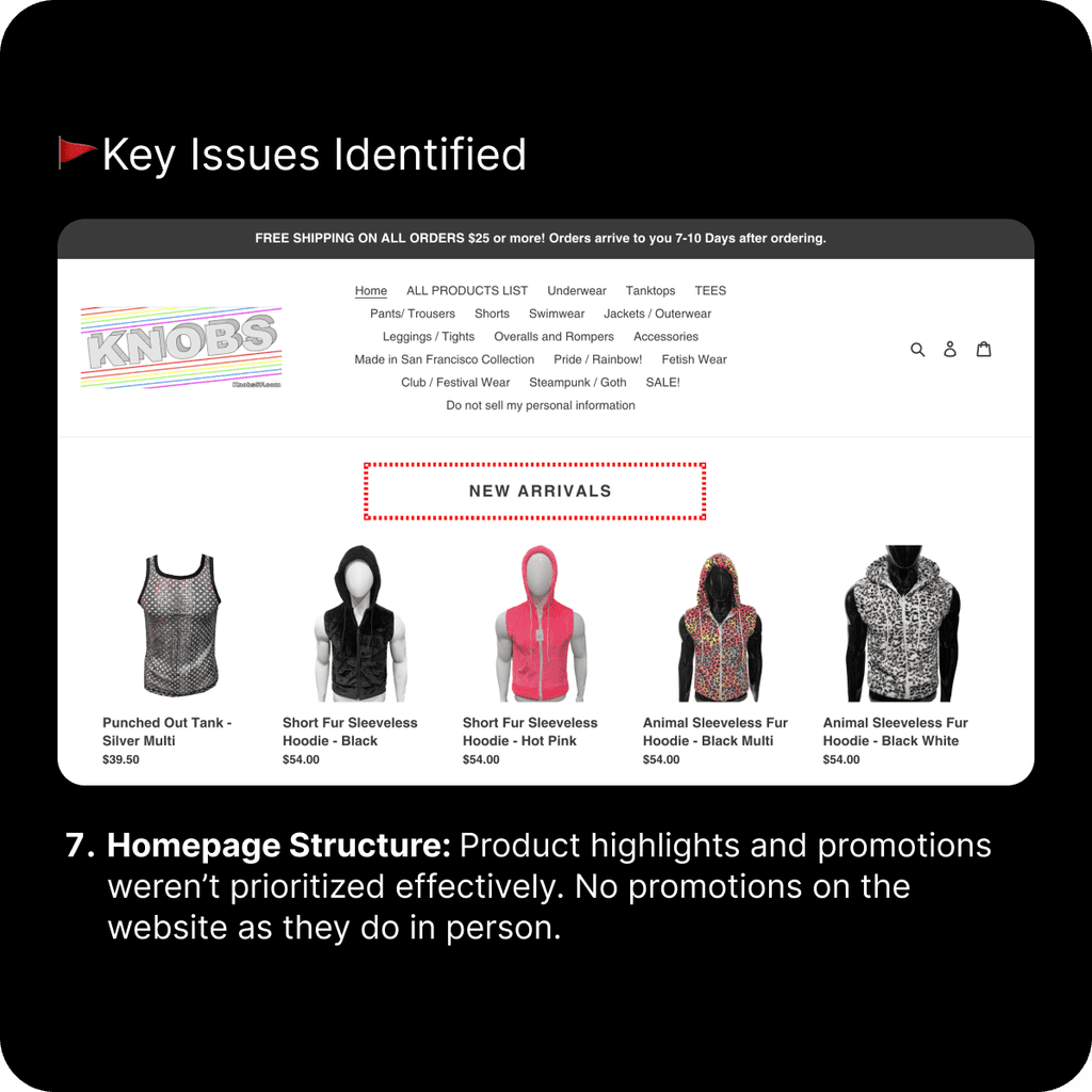
New Visual Identity: Bringing Knobs to Life Online

With the structure and information architecture in place, it was time to translate Knobs’ essence into a bold and approachable visual language. The big question: How could I bring the playful, colorful energy of the in-store experience, and meet Michael West’s need for clarity and style, into a visually engaging, user-friendly digital space?

I began by selecting a typeface that reflects Knobs' personality while keeping readability and accessibility at the forefront. After exploring a few options, I landed on Helvetica Neue—a typeface that's clean, modern, and flexible enough to balance both fashion-forward aesthetics and practical UI needs.

With the structure and information architecture in place, it was time to translate Knobs’ essence into a bold and approachable visual language. The big question: How could I bring the playful, colorful energy of the in-store experience, and meet Michael West’s need for clarity and style, into a visually engaging, user-friendly digital space?

I began by selecting a typeface that reflects Knobs' personality while keeping readability and accessibility at the forefront. After exploring a few options, I landed on Helvetica Neue, a typeface that's clean, modern, and flexible enough to balance both fashion-forward aesthetics and practical UI needs.

Choosing a color palette was a fun but complex challenge. Since Knobs sells bright, colorful pieces, I didn’t want to mute that spirit online. I decided to let photos lead the way, uploading sample images and using tools like Adobe Color to extract tones directly from the real-world store. The result? A lively mix of purples and blues, inspired by Knobs’ physical location and anchored in visual consistency.

As I refined the site’s look, I realized the logo needed love, too. The current version lacked readability and cohesion. Inspired by the original rainbow spectrum, I reimagined the logo in a simplified, rounded form, keeping its vibrant energy while ensuring it scales well across devices and screen sizes.

The Final Design

After rounds of research, testing, sketching, and visual exploration, it was finally time to bring Knobs to life through a high-fidelity prototype. This was where everything- Michael’s journey, the refined navigation, the curated categories, and the bold visual identity- came together in one seamless, interactive experience.

After rounds of research, testing, sketching, and visual exploration, it was finally time to bring Knobs to life through a high-fidelity prototype. This was where everything- Michael’s journey, the refined navigation, the curated categories, and the bold visual identity- came together in one seamless, interactive experience.

My goal was to create a design that felt authentic to Knobs; playful, stylish, and unapologetically expressive; while still being user-friendly and easy to navigate.

My goal was to create a design that felt authentic to Knobs; playful, stylish, and unapologetically expressive; while still being user-friendly and easy to navigate.

Product Success

After redesigning Knobs’ website with shoppers like Michael West in mind, I was able to deliver a digital experience that better reflects the in-store energy Knobs is known for. The restructured navigation, clearer product categorization, and streamlined shopping flow helped to meet their needs.

Early usability testing feedback validated key design decisions, particularly around the updated visual style, and users expressed that they felt more confident making purchases. The design now bridges the gap between Knobs’ vibrant physical store and its online presence.

Next Steps

While the redesign set a solid foundation, there’s still more to explore. If given more time, I would:

  • Conduct usability testing on the high-fidelity prototype to validate user flows and identify any pain points.

  • Collaborate with developers for a smooth handoff and to ensure the design is implemented as intended.

  • Track key metrics post-launch, such as bounce rates, product views, and cart abandonment, to measure the impact of the redesign.

  • Iterate based on real user behavior to improve filters, product tags, and wishlist functionality.

  • Create a mobile-responsive version, aligning with competitors’ digital strategies.

  • Add features like back-in-stock notifications to enhance the overall shopping experience.

What I learned

This project challenged me to go beyond surface-level design and understand the importance of the entire UX process. It was a powerful learning experience in how to bridge business goals and user needs through thoughtful, user-centered decisions.

Here’s what stood out the most:

  • Designing with a specific persona in mind—in this case, Michael West—guided every decision with clarity.

  • Using information architecture and card sorting helped demystify user expectations and structure content more intuitively.

  • Balancing brand identity with accessibility and usability created a design that felt authentic and inclusive.

  • Time management was key during this solo design sprint—though it would be exciting to evolve it into a collaborative team project in the future.

  • Staying flexible is essential: design is rarely linear, and feedback is always an opportunity for growth.

Above all, I’m proud of how this project helped elevate Knobs’ legacy, translating their beloved physical shopping experience into a thoughtful, emotional, and effective digital journey.

Mettalic shape background image

Contact

Let's Get in Touch

Let's connect and start with your project ASAP.

Mettalic shape background image

Contact

Let's Get in Touch

Let's connect and start with your project ASAP.

Mettalic shape background image

Contact

Let's Get in Touch

Let's connect and start with your project ASAP.

E-commerce Website Redesign

E-commerce Website Redesign

Knobs

Knobs SF is a San Francisco-based retailer specializing in men's fashion, particularly catering to the LGBTQ+ community.

UX Designer • UI Designer • Researcher

2 weeks

Solo Project

Visit Project